The UX of Data
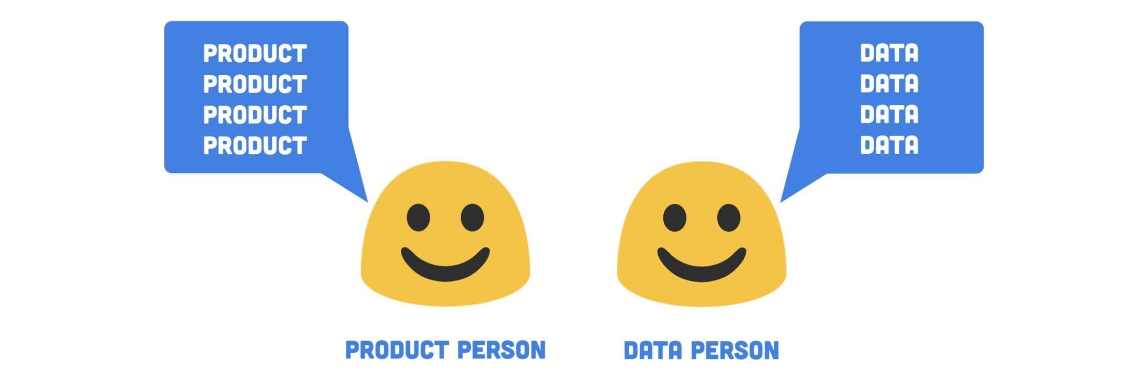
Growth designer Lex Roman gives advice on how your cross-functional team should talk about data.

Generating data is easy. Ensuring it is reliable and widely accessible is hard.
Data is often not accessible unless you can write code. People in non-technical roles rely on data every day to make decisions, develop ideas or measure success. When tools and systems are not created with them in mind, they lose trust and understanding. They lose their bearings and end up relying on other methods to make decisions.
Even when you can write SQL, Python or R, you may not have all the access you need. You may not understand someone else’s definition or report.
It doesn’t have to be this way. We can create empathetic, intuitive systems for sharing information. With a bit of human-centric thinking, teams can build shared understanding of why, what and how to measure their work. When everyone on the team is empowered to understand data, they can make more informed decisions and measure their own success.
When everyone on the team is empowered to understand data, they can make more informed decisions and measure their own success.
The Gap of Confusion
I’ve worked at many kinds of companies—large and small. And in my time at all of these organizations, I’ve observed a disconnect between data and people. Let me explain with a story.
Meet Francesca. Francesca is a Product Manager. She goes to her colleague Enzo who is a Data Analyst to ask for help.
ref Francesca: “Hey Enzo, could you help me understand what caused this shift in sign up rate?”
ref Enzo: “I’d love to help you, Francesca. But I’m working on some predictive models right now so I can’t prioritize that yet but I will add it to my list!”
And right there—there’s a gap. Francesca is not able to get the immediate insights she needs. And Enzo’s work has no clear relationship to the product team’s work, which means it may be unclear how to make his work actionable.
Add to the mix the many other stakeholders in an organization who want to get their hands on better data. Given that data teams can’t be everything to everyone, each department starts grasping at different tools. The company ends up with a pile of disconnected, unreliable information. And a lot of third party bills to pay. Fun!
Over time, this becomes extremely unmanageable. Everyone who joins your company brings new tools with them. Important decisions go undocumented. Data becomes more difficult to read and interpret, even for the skilled data users. Data abounds but insights are hard to come by.
The experience of using data becomes broken and painful.
Strategies for Closing the Gap of Confusion
How do you close the gap? First, you acknowledge that there is a gap to close. Second, you facilitate conversations with a range of people about what needs to happen to make data reliable and accessible. Sounds so easy, right?
But, there’s good news! (What’s the good news, Lex?) So glad you asked!
The good news is that you can start anywhere—solve any part of the system—and you will be helping to improve the data experience for your teammates.
Below I’ve outlined three specific strategies you can use to close the gap of confusion at your company. Pick one and start closing gaps!
Strategy 1 — Roles
Define who owns what when it comes to data
To illustrate this strategy, let’s visit Wayne from Marketing and see how he’s using data in his work.
Wayne from Marketing thinks…
ref “Hmmm, I wonder how many people start onboarding on mobile and then move to their computer?”
But Wayne only knows how to use Google Analytics. He doesn’t know if that’s even possible to see in there. He also knows the data team is really busy with more important projects. So instead, he just gives up. He decides to make an assumption and move on with his day.
In this situation, Wayne wants to use data. He even knows where to look, but it’s not clear to him who he should go to for help. He’s been conditioned to not bother the data team. He hasn’t been empowered to get the support he needs.
One simple thing that would help Wayne is clear ownership. Not everything involving data is owned by one person or team, even at a large enterprise company. Breaking down the responsibility can help everyone understand who owns what and it can help spread the load across more people.
Not everything involving data is owned by one person or team, even at a large enterprise company.
Step 1: Define What Needs Ownership
Start a list of all the things that involve data at your company. If that’s an overwhelming task, just start with your team or project. For example, list all the tools out. List all the data sources. I’ve also included a brief list below you can use as a starting point.
Step 2: Define Who Owns What
It may be obvious who owns what but more likely, you’ll identify some areas where it’s not clear. For example, is any one person in charge of what information about users is tracked? Who is the Google Analytics administrator? Who chose Google Analytics in the first place and who do you go to switch it to a different tool?
To identify owners, you’ll need to have conversations. I know conversations are hard so here are some ways to approach them:
- Hold one on ones with people who might have answers
- Send out an internal survey
- Hold a workshop or small group sessions
- Make an organizational chart for data ownership and share it for feedback
- Just decide yourself*
only works if you’re in charge
Again, depending on company size, this may be a monumental task. If that’s the case, just start with whatever is pressing for you or your team. Help Wayne out on Google Analytics by finding out who owns that or at least, who can answer questions. Wayne, we’re here for you dude.
Do make sure to share your progress out as you define owners. Ownership that’s defined but not shared doesn’t do much good.
Strategy 2 — Systems
Intuitive tools and naming
It’s not enough for data to exist somewhere. It has to be understood. And it has to be understood by everyone. The less ambiguity, the better. Our Product Manager friend, Sophia, knows this feeling well. She’s been trying to understand the impact of her team’s work on MRR. She turns to a saved dashboard in their business intelligence tool.
It’s not enough for data to exist somewhere. It has to be understood.
Source: Baremetrics
Cool, looks good.
Wait…what? This seems crazy low to Sophia. $6,000 a month isn’t going to pay the bills. Where is this data coming from? And what do all these colors mean?
Sophia can’t trust this data. How will she get the answers she needs?!
Sophia and her team could choose more intuitive tools for displaying and interacting with data.
Data is a form of communication. Our data systems are communicating to its users. And we can improve how it communicates.
Step 1: Choose tools that are accessible
When selecting tools for your team, consider the skill level of your colleagues. Does everyone write SQL? Can everyone spell SQL?
Look for tools that:
- Have easy to understand visualizations
- Are flexible (can you look at data in different ways?)
- Allow for non-technical colleagues to explore data
- Promote collaboration (can you comment on something? can more than one person work on a data project?)
- Allow you to connect the dots between multiple data sources
Here’s an example of the above from Amplitude. Their tool allows you to calculate events in multiple ways and it allows you to change how they are visualized. It also has a clear color key and allows you to edit labels so they’re easier to understand. It doesn’t rely on a data practitioner to create every chart.
Source: Amplitude’s Demo Project
I also recommend looking at Segment’s integration catalog for a sense of what tools are popular.
Download the UX of Data worksheet
Step 2: Use clear and unique names
Name things in ways humans can understand so that there’s no confusion about what a data point means.
If you use plain language, it’s easier to keep definitions consistent across a company. If one team thinks “sign up” happens when someone clicks a landing page button and another team is tracking “user created” in the database, then you have a disconnect. Poor decisions being made from confusing information.
Here’s an example from Airbnb. I’ve named a few pieces of information I need to track success. The names mimic the way I would describe a user’s actions out loud. It will be more intuitive for my colleagues right off the bat. Bonus points if you actually include these product visualizations in your data documentation.
ref For example, I might say: Salvatore, the customer, searched for an experience Then, I might want to know how many customers searched experiences.
Example measurement definition:
Your team should define its own data conventions but the more human the data reads, the easier it will be for humans to understand.
Step 3: Document important definitions alongside the data
If you insist on naming things in a confusing way or if there’s no way around the confusion, then put the definition right there in the reports. Make it dummy proof how to read the data.
Back to my favorite intuitive tool, Amplitude. In their tool, you can define what each data element means. And when you hover over a term, it shows the definition right there in the chart. Brilliant!
Source: Amplitude’s Demo Project
If you don’t have that capability with your tool, do your best to include it in the report name or as a comment in the code of your query. Or worst case, document it elsewhere and share it with your team.
Back to the hero of our story—Sophia, the Product Manager. Thanks to all your hard work implementing intuitive tools and naming conventions, she was able to find the correct MRR visualization. Go you! Go Sophia!
Strategy 3 — Capabilities
Leveling up your team
Regardless of how well you define data owners and work to build intuitive systems, there will always be a need for expanding data literacy. Data is hard. Everyone is coming to your team from different perspectives and with different levels of experience. Helping your team understand and act on data is in everyone’s best interest. It helps your company make well-informed decisions and it helps you not have to put out fires due to confusion or misread information.
There will always be a need for expanding data literacy.
ref Slack message 4:15am @channel Uh, it looks like revenue is down 50%!? Has anyone seen this?
No thanks!
Alright, so to avoid this, how do you help level up your team? Let’s consult our pal, Gerald on the design team.
Gerald says “I’m just not a numbers person. I don’t get data!”
Hey Gerald, don’t you want to see the impact of your work? Don’t you want to learn more about your users and customers and gain valuable inputs into your designs?! Don’t you want a raise for making the company a boatload of money?! Of course you do! You just don’t know how.
Lucky for Gerald, he has us—a human-centric team. We can meet Gerald where he is with data and help him get up to speed on how he can use it in his work.
Step 1: Define what to teach
Figure out what skills are most needed at your company. Identify gaps that can’t be solved with systems, tools and naming. Look for anything that could be at risk for human error.
Consider:
- What technical skills people may need to effectively use data
- Anything that’s unique about your data infrastructure or reporting
- Anything that’s high value that you want to ensure everyone knows how to do (for example, how to look at the OKRs for the quarter in your data tools)
- How to communicate roles and ownership
- How people should ask for support
Then, prioritize your list of what to teach based on the biggest need.
Step 2: Define how to teach it
Some companies formalize an internal “data school”. If your company is able to invest in something like that, stellar! That sounds super cool!
If not, you can try different formats to see what works best for comprehension.
Options include:
- Onboarding workshops or trainings
- Ongoing workshops or trainings
- Creating videos
- Gathering content from the web (or using something like DataCamp)
- Writing blog posts
- Giving lunch talks or hosting a series of lunch talks
- Joining existing team meetings to share relevant tutorials
- Start a Slack channel (don’t @ me)
- Share online notebooks with annotations
- Hold office hours
With all these wonderful options, our friend Gerald back in the design department is really starting to become a numbers person! He’s psyched because he can see the impact of his work and you’re psyched because he makes more informed decisions! Best of all, he can help share those capabilities with those around him. Also, his eyeballs aren’t melting anymore! It’s an all around win.
Together—we can fill the gap of confusion.
With clearer roles, intuitive systems and shared capabilities, data becomes an organizational super power, not just the job of one team. We can empower our teammates to understand who to go to, how to read information and how to incorporate data into their work.
With clearer roles, intuitive systems and shared capabilities, data becomes an organizational super power.
When we achieve this, we build more appreciation for the role of data at our companies. We reduce the thrash that happens with data is confusing. We make more informed decisions. We can confidently measure the success of our work.
Download the UX of Data worksheet

Lex Roman
Independent Growth Designer
Lex Roman is an independent Growth Designer based in Los Angeles. She drives business growth through customer understanding and strategic design. Previously, she led growth design and product analytics at Burner and practiced early stage validation and conversion strategy at Carbon Five. Past clients include Nissan, Prosper, Joyable, Macys.com, Toyota and some startups you’ve never heard of because they didn’t make it.
More from Lex


